Sar/Visualize CPU data
This is a five minute guide how to visualize Linux's sar data provided by the sysstat utility without a lot of mangeling the data.
Goal
Create CPU graphs in R from the sar utility without massaging the output data too much.
Prerequisites
- The Linux sysstat package installed and configured to report performance data.
- R
- ggplot2 R library
Howto
Dumping the sar data with sadf
The data sar collects is in binary format and needs to be converted first to a format that can be imported into R. This is done with the sadf command which converts the collected data into tabular data delimited by semicolon.
Note: On CentOS 6 and higher the sadf command also prints a header file to make most use of it we need to slightly changes it like remove the leading #, plus remove the % from the cpu data but only in the first. Other lines starting with # or containing a LINUX-RESTART should also be removed.
sadf -t -d -P ALL <SAR-FILE> | \
  sed -e '1,1s/\(^#\|%\)//g' \
      -e '/\(^#\|LINUX-RESTART\)/d' \
  > <SADF-OUTPUT>
Importing the data into R
The next step is to read the tabular data into R and print the graphs there are just a handful of commands to do this. In R type the following commands.
library( ggplot2 )
cpu.data <- read.csv( file="<SADF-OUTPUT>", sep=";" )
cpu.data$timestamp <- as.POSIXct( cpu.data$timestamp )
cpu.data$CPU[ cpu.data$CPU == "-1" ] <- "all"
cpu.graph <- ggplot( data=cpu.data, aes( x=timestamp, y=user, group=CPU, colour=CPU ) )
cpu.graph + geom_line()
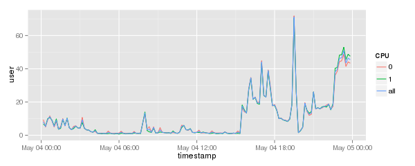
Will result in a graph like this:

Plotting each CPU separately
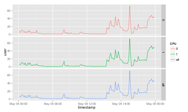
To show which CPU or core is used most it is probably better to separately print the CPUs. The ggplot2 library comes with a nifty command called facet_grid(). To print each separately simply add it to the end of the previous command.
cpu.graph + geom_line() + facet_grid( CPU~. )
Which will result in a graph like this.
