Difference between revisions of "Sar/Visualize CPU data"
| (13 intermediate revisions by the same user not shown) | |||
| Line 1: | Line 1: | ||
{{DISPLAYTITLE: Visualize sar CPU data with R}} |
|||
This is a five minute guide how to visualize Linux's <tt>sar</tt> data provided by the <tt>sysstat</tt> utility without a lot of mangeling the data. |
This is a five minute guide how to visualize Linux's <tt>sar</tt> data provided by the <tt>sysstat</tt> utility without a lot of mangeling the data. The examples outlined below were done in CentOS 6.5. For other distros or Unix flavors your milage may vary. |
||
== Goal == |
== Goal == |
||
| Line 11: | Line 12: | ||
== Howto == |
== Howto == |
||
=== Dumping the <tt>sar</tt> data with <tt>sadf</tt> === |
=== Dumping the <tt>sar</tt> data with <tt>sadf</tt> === |
||
The data <tt>sar</tt> collects is in binary format and needs to be converted first to a format that can be imported into <tt>R</tt>. This is done with the <tt>sadf</tt> command which converts the collected data into tabular data delimited by semicolon. |
The data <tt>sar</tt> collects is in binary format and needs to be converted first to a format that can be imported into <tt>R</tt>. This is done with the <tt>sadf</tt> command which converts the collected data into tabular data delimited by semicolon. <br /> |
||
'''Note:''' On CentOS 6 and higher the <tt>sadf</tt> command also prints a header file to make most use of it we need to slightly changes it like remove the leading <tt>#</tt>, plus remove the <tt>%</tt> from the cpu data but only in the first. Other lines starting with <tt>#</tt> or containing a <tt>LINUX-RESTART</tt> should also be removed. Your milage may vary! |
|||
| ⚫ | |||
| ⚫ | |||
sed -e '1,1s/\(^#\|%\)//g' \ |
|||
-e '/\(^#\|LINUX-RESTART\)/d' \ |
|||
> <span class="input"><SADF-OUTPUT></span> |
|||
=== Importing the data into R === |
=== Importing the data into R === |
||
| Line 18: | Line 24: | ||
library( ggplot2 ) |
library( ggplot2 ) |
||
cpu.data <- read.csv( file="<span class="input">< |
cpu.data <- read.csv( file="<span class="input"><SADF-OUTPUT></span>", sep=";" ) |
||
cpu.data$timestamp <- as.POSIXct( cpu.data$timestamp ) |
cpu.data$timestamp <- as.POSIXct( cpu.data$timestamp ) |
||
cpu.data$CPU[ cpu.data$CPU == "-1" ] <- "all" |
cpu.data$CPU[ cpu.data$CPU == "-1" ] <- "all" |
||
With very little effort data is read into <tt>data.table</tt> format. Then we have to change the format of two fields. Namely <tt>timestamp</tt> needs conversion from a string to a proper time format like <tt>POSIXct</tt>. Plus the value for all CPUs is "-1" and to make it clear to the viewer we want it to be "all". |
|||
After the changes the structure of the cpu.data should look like the below data. |
|||
str( cpu.data ) |
|||
'data.frame': 429 obs. of 10 variables: |
|||
$ hostname : Factor w/ 1 level "hostname.local": 1 1 1 1 1 1 1 1 1 1 ... |
|||
$ interval : int 588 588 588 590 590 590 589 589 589 588 ... |
|||
$ timestamp: <span class="highlight">POSIXct</span>, format: "2014-05-04 00:10:01" "2014-05-04 00:10:01" ... |
|||
$ CPU : <span class="highlight">chr</span> "all" "0" "1" "all" ... |
|||
$ user : <span class="highlight">num</span> 8.05 9.39 6.73 5.28 5.02 ... |
|||
$ nice : num 0 0 0 0 0 0 0 0 0 0 ... |
|||
$ system : num 3.83 4.32 3.34 2.75 3.21 2.3 4.59 4.99 4.19 5.1 ... |
|||
$ iowait : num 0.71 1.1 0.33 0.7 1.1 0.3 0.7 1.12 0.29 0.81 ... |
|||
$ steal : num 0 0 0 0 0 0 0 0 0 0 ... |
|||
$ idle : num 87.4 85.2 89.6 91.3 90.7 ... |
|||
=== Setting up the graph === |
|||
The next step is to store the ggplot data into a variable for further processing. It's important to group the data by the <tt>CPU</tt> field and assign a different color to each CPU with the <tt>colour=</tt> assignment. |
|||
cpu.graph <- ggplot( data=cpu.data, aes( x=timestamp, y=user, group=CPU, colour=CPU ) ) |
cpu.graph <- ggplot( data=cpu.data, aes( x=timestamp, y=user, group=CPU, colour=CPU ) ) |
||
| ⚫ | |||
=== Display the result as a line graph === |
|||
To display the graph a simply calling the stored graph data and assigning a layer with <tt>geom_line()</tt>. |
|||
| ⚫ | |||
Will result in a graph like this: |
|||
[[Image:Cpu-data-consolidated.png]] |
[[Image:Cpu-data-consolidated.png]] |
||
=== Plotting each CPU separately === |
=== Plotting each CPU separately === |
||
To show which CPU or core is used most it is probably better to separately print the CPUs. The <tt>ggplot2</tt> library comes with a nifty command called <tt>facet_grid()</tt>. To print each separately simply add it to the end of the previous command. |
To show which CPU or core is used most it is probably better to separately print the CPUs. The <tt>ggplot2</tt> library comes with a nifty command called <tt>facet_grid()</tt>. To print each separately simply add it to the end of the previous command. |
||
| Line 34: | Line 64: | ||
[[Image:Cpu-data-grid.png]] |
[[Image:Cpu-data-grid.png]] |
||
=== Combining it with more data === |
|||
To really make this graph useful a few more data points need to be added in this case iowait and system. To make sure they are not overlapping the data needs to be stacked. Firstly a new graph variable needs to be defined. And then for each y axis a new <tt>geom_line</tt> is defined. There is probably better ways but the of each is calculated and then plotted. The <tt>facet_grid</tt> got a bit of an upgrade and has better labeling. The last three lines are sugar coating to make the graph fit for management :). |
|||
cpu.stacked <- ggplot( data=cpu.data, aes( x=timestamp, group=CPU ) ) |
|||
cpu.stacked + |
|||
geom_line( aes( y=iowait+user+system, colour="system" ) ) + |
|||
geom_line( aes( y=iowait+user, colour="user" ) ) + |
|||
geom_line( aes( y=iowait, colour="iowait" ) ) + |
|||
facet_grid( CPU~., labeller=label_both ) + |
|||
xlab( "Datetime" ) + |
|||
ylab( "CPU usage" ) + |
|||
theme( legend.title=element_blank() ) |
|||
The result is: |
|||
[[Image:Cpu-data-full.png]] |
|||
=== Showing more detail by reducing the window === |
|||
When using SAR data with a high frequency probe over a long time span it is good to show an overall trend. When locating a hotspot it makes sense to zoom in by reducing the window. This is done by subsetting the data. |
|||
cpu.data.sub <- subset( cpu.data, timestamp %in% as.POSIXct( "2014-01-29 02:00:00" ):as.POSIXct( "2014-01-29 04:00:00" ) ) |
|||
Then run the graph code above again with the newly created data frame. |
|||
=== Saving the graph to a file === |
|||
Especially when automation comes into play saving to a file is a must this example shows how to save to PNG. |
|||
setwd( "/home/r-user/cpu-data" ) |
|||
png( "cpu-graph-grid.png", width=600, height=360, res=72 ) |
|||
cpu.graph + geom_line() + facet_grid( CPU~. ) |
|||
dev.off() |
|||
[[Category: R]] |
[[Category: R]] |
||
Latest revision as of 22:50, 31 January 2016
This is a five minute guide how to visualize Linux's sar data provided by the sysstat utility without a lot of mangeling the data. The examples outlined below were done in CentOS 6.5. For other distros or Unix flavors your milage may vary.
Goal
Create CPU graphs in R from the sar utility without massaging the output data too much.
Prerequisites
- The Linux sysstat package installed and configured to report performance data.
- R
- ggplot2 R library
Howto
Dumping the sar data with sadf
The data sar collects is in binary format and needs to be converted first to a format that can be imported into R. This is done with the sadf command which converts the collected data into tabular data delimited by semicolon.
Note: On CentOS 6 and higher the sadf command also prints a header file to make most use of it we need to slightly changes it like remove the leading #, plus remove the % from the cpu data but only in the first. Other lines starting with # or containing a LINUX-RESTART should also be removed. Your milage may vary!
sadf -t -d -P ALL <SAR-FILE> | \
  sed -e '1,1s/\(^#\|%\)//g' \
      -e '/\(^#\|LINUX-RESTART\)/d' \
  > <SADF-OUTPUT>
Importing the data into R
The next step is to read the tabular data into R and print the graphs there are just a handful of commands to do this. In R type the following commands.
library( ggplot2 )
cpu.data <- read.csv( file="<SADF-OUTPUT>", sep=";" )
cpu.data$timestamp <- as.POSIXct( cpu.data$timestamp )
cpu.data$CPU[ cpu.data$CPU == "-1" ] <- "all"
With very little effort data is read into data.table format. Then we have to change the format of two fields. Namely timestamp needs conversion from a string to a proper time format like POSIXct. Plus the value for all CPUs is "-1" and to make it clear to the viewer we want it to be "all".
After the changes the structure of the cpu.data should look like the below data.
str( cpu.data )
'data.frame':	429 obs. of  10 variables:
 $ hostname : Factor w/ 1 level "hostname.local": 1 1 1 1 1 1 1 1 1 1 ...
 $ interval : int  588 588 588 590 590 590 589 589 589 588 ...
 $ timestamp: POSIXct, format: "2014-05-04 00:10:01" "2014-05-04 00:10:01" ...
 $ CPU      : chr  "all" "0" "1" "all" ...
 $ user     : num  8.05 9.39 6.73 5.28 5.02 ...
 $ nice     : num  0 0 0 0 0 0 0 0 0 0 ...
 $ system   : num  3.83 4.32 3.34 2.75 3.21 2.3 4.59 4.99 4.19 5.1 ...
 $ iowait   : num  0.71 1.1 0.33 0.7 1.1 0.3 0.7 1.12 0.29 0.81 ...
 $ steal    : num  0 0 0 0 0 0 0 0 0 0 ...
 $ idle     : num  87.4 85.2 89.6 91.3 90.7 ...
Setting up the graph
The next step is to store the ggplot data into a variable for further processing. It's important to group the data by the CPU field and assign a different color to each CPU with the colour= assignment.
cpu.graph <- ggplot( data=cpu.data, aes( x=timestamp, y=user, group=CPU, colour=CPU ) )
Display the result as a line graph
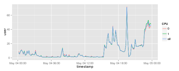
To display the graph a simply calling the stored graph data and assigning a layer with geom_line().
cpu.graph + geom_line()
Will result in a graph like this:
Plotting each CPU separately
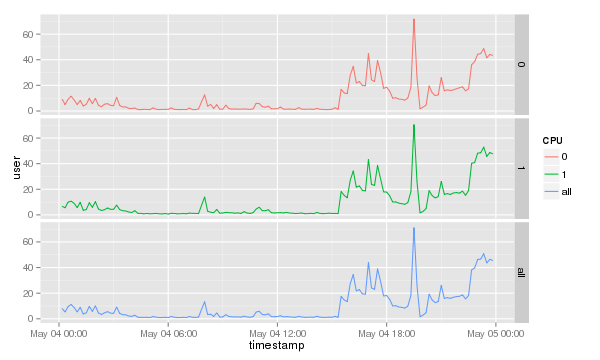
To show which CPU or core is used most it is probably better to separately print the CPUs. The ggplot2 library comes with a nifty command called facet_grid(). To print each separately simply add it to the end of the previous command.
cpu.graph + geom_line() + facet_grid( CPU~. )
Which will result in a graph like this.
Combining it with more data
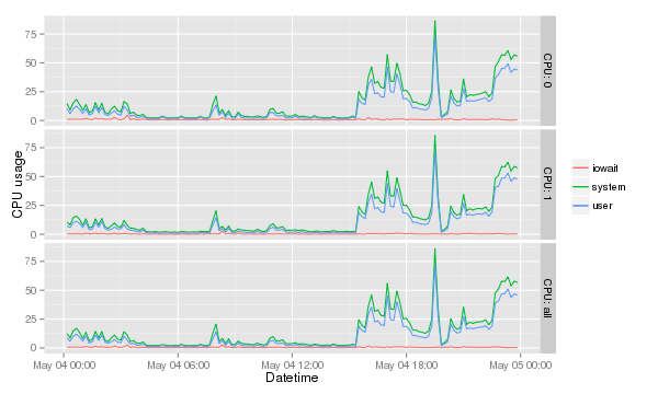
To really make this graph useful a few more data points need to be added in this case iowait and system. To make sure they are not overlapping the data needs to be stacked. Firstly a new graph variable needs to be defined. And then for each y axis a new geom_line is defined. There is probably better ways but the of each is calculated and then plotted. The facet_grid got a bit of an upgrade and has better labeling. The last three lines are sugar coating to make the graph fit for management :).
cpu.stacked <- ggplot( data=cpu.data, aes( x=timestamp, group=CPU ) )
cpu.stacked +
  geom_line( aes( y=iowait+user+system, colour="system" ) ) +
  geom_line( aes( y=iowait+user, colour="user" ) ) +
  geom_line( aes( y=iowait, colour="iowait" ) ) +
  facet_grid( CPU~., labeller=label_both ) +
  xlab( "Datetime" ) +
  ylab( "CPU usage" ) +
  theme( legend.title=element_blank() )
The result is:
Showing more detail by reducing the window
When using SAR data with a high frequency probe over a long time span it is good to show an overall trend. When locating a hotspot it makes sense to zoom in by reducing the window. This is done by subsetting the data.
cpu.data.sub <- subset( cpu.data, timestamp %in% as.POSIXct( "2014-01-29 02:00:00" ):as.POSIXct( "2014-01-29 04:00:00" ) )
Then run the graph code above again with the newly created data frame.
Saving the graph to a file
Especially when automation comes into play saving to a file is a must this example shows how to save to PNG.
 setwd( "/home/r-user/cpu-data" )
 png( "cpu-graph-grid.png", width=600, height=360, res=72 )
 cpu.graph + geom_line() + facet_grid( CPU~. )
 dev.off()


