Visualize ping latency with R
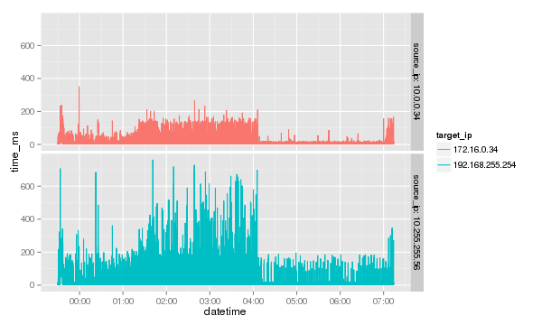
I got recently into a troubleshooting session where a performance issue between two hosts looked like a problem with the network. Network round trip time that should be in the range of 0.2ms shot up to around 2000ms every 30 seconds. To fence the problem I set up ad hoc ping probes on multiple hosts and multiple to different targets. Letting the data collection run for a few days, I gathered data in a file that was 1.5 million lines large. To analyze the data I created a graph with R.
Goal
Gather a large amount of network latency data with ping in a semicolon separated file on multiple hosts and compare the data by plotting it out with R.
Prerequisites
- A bunch of Linux hosts (other OS might work but the collector code needs to be adjusted)
- R
- ggplot2 R library
- Passwordless access to the hosts running the ping [optional]
Howto
Collect data
To collect the ping data an ssh connection to host collecting the data is made and the collected data is written to file. The HOSTS variable holds the ping source and ping destination as a colon ":" seperated list. The awk in this example expects the GNU version to be present.
HOSTS="ping01:pong01 ping02:pong02"
for hosts in ${HOSTS}; do
    source=${hosts%%:*}
    source_ip=$( getent hosts ${source} | cut -d " " -f 1 )
    target=${hosts##*:}
    file=/var/tmp/$( date +%F )_${source}-${target}_ping-test.txt
    ssh -f -n ${source} \
      "echo 'datetime;source_ip;target_ip;proto;sequence;ttl;time_ms' > ${file}; \
       ping -i 1 -n ${target} | \
       awk -F '[ =_]' -v source_ip=${source_ip} \
        '!/NA|^PING/{
           printf( \"%s;%s;%s;%s;%s;%s;%s\n\",
                   strftime( \"%F %T\" ),
                   source_ip,
                   gensub( \":\", \"\", \"\", \$4 ),
                   \$5,
                   \$7,
                   \$9,
                   \$11 );
        }' >> ${file}" #2>/dev/null
done
The collected data file looks like the exerpt below:
datetime;source_ip;target_ip;proto;sequence;ttl;time_ms
2014-06-20 23:30:05;10.0.0.34;172.16.0.34;icmp;1;64;10.7
2014-06-20 23:30:06;10.0.0.34;172.16.0.34;icmp;2;64;10.0
2014-06-20 23:30:07;10.0.0.34;172.16.0.34;icmp;3;64;4.61
2014-06-20 23:30:08;10.0.0.34;172.16.0.34;icmp;4;64;11.5
Combining the files
Depending on the time span the test is running the files can become quite large. For the analysis the data of all the files needs to be merged into one large file. Best done with a loop once more. The sed at the end ensures that only one header remains.
PING_DATA=/var/tmp/combined_ping_data.txt
HOSTS="ping01:pong01 ping02:pong02"
for hosts in ${HOSTS}; do
    source=${hosts%%:*}
    target=${hosts##*:}
    file=/var/tmp/????-??-??_${source}-${target}_ping-test.txt
    ## ssh ${source} "pkill ping"
    ssh ${source} "cat ${file}" 2>/dev/null
done | sed -e '1p; /datetime/d;' > ${PING_DATA}
Visualizing the result with R and ggplot2
In the R console run the following command sequence
library( ggplot2 )
ping.data <- read.csv( "/var/tmp/combined_ping_data.txt", sep=";", header=T )
ping.data$datetime <- as.POSIXct( ping.data$datetime )
ggplot( data=ping.data, aes( x=datetime, y=time_ms, colour=target_ip ) ) +
  geom_line() +
  facet_grid( target_ip~., labeller=label_both )
Note: The resulting graph like the one below will only work if there is more than one source_ip in the dataset.
