Visualize pcap file data
One nice day I was given orders to produce network usage statistics to find eventual burst in the network stream. I faced two problems with this task. The network monitoring software was graphing the network flow only every minute which was too coarse and the interface was connected to a switch I had no control over at all, A mirror port had to be ruled out. The assignment was to collect data for a week and then look at the numbers.
I was unsure how to go about it in the first place. To not fall behind I ran tcpdump on the hosts in question until the week was over. At that point in time I had no idea how to process the pcap dump data and I had not the faintest clue how to present it at the end of the week. After a lot of searching I finally came across a nifty feature in tshark allowing me to aggregate bandwidth on a per second basis. Below is a short recipe how to create graphs from captured network traffic.
Prerequisites
- capture file the wireshark suite understands. E.g. pcap or Solaris snoop among others.
- tshark
- ruby
- R
- ImageMagick's montage [optional]
Howto
Aggregate traffic with tshark
To properly graph the data tshark needs to generate statistic on a per second basis. The below command will achive this.
tshark -q -z 'io,stat,1' -r <PcapFile> > <StatisticsFile>
The output is looking something like the excerpt below.
<<<<<<< <StatisticsFile>
=======
Time            |frames|  bytes
000.000-001.000      62      5578
001.000-002.000      62      5386
002.000-003.000      62      5692
003.000-004.000      62      5968
004.000-005.000      62      5428
005.000-006.000      62      5838
006.000-007.000      62      5912
The only problem with the output above is that the time is relative to the start of the pcap file. Before passing the data to R it has to be properly massaged.
Convert the time with ruby
Note: I'm pretty sure this part could be done in R but with the deadline looming I decided to write it in a language I'm familiar with.
My data captures are usually automated using a script that writes the start date and time into the file name to make it unique. The below ruby script assumes the file names being passed to it are in the form of <String>-YYYY-MM-DD_hh-mm.stats
#!/usr/bin/ruby

$files = ARGV

dateRegex = /(\d{4})-(0[1-9]|1[0-2])-(0[0-9]|[12][0-9]|3[01])_([01][0-9]|2[0-4])-([0-5][0-9])/

$files.each do |file|
    file.match( dateRegex )
    $time = Time.local( $1, $2, $3, $4, $5, 0 )

    $fh = File.open( file + ".ts", "w" )
    File.open( file ).each do |line|
        # filter lines
        next unless line.match( /^(Time|\d)/ )
        line.strip!
        if line.sub!( /^(\d+).*?\s(.*)/, '\2' )
            #line = ( $time + $1.to_i ).strftime( "%H:%M:%S" ) + line
            line = ( $time + $1.to_i ).strftime( "%s" ) + line
            line.gsub!( /\s+/, "\t")
        else
            line.gsub!( /\s+/, "")
            line.gsub!( /\|/, "\t")
        end
        $fh.puts line
    end
    $fh.close
end
Invoke the script as shown below assuming the above script is saved as make-timestamp.rb.
ruby make-timestamp.rb *stats
This will produce a file called <String>-YYYY-MM-DD_hh-mm.stats.ts. Below is an example of the file. Note: the time is in Epoch for easier processing in R.
Time    frames  bytes
1318546800      62      5314
1318546801      62      5780
1318546802      62      6062
1318546803      62      5894
1318546804      62      5424
1318546805      62      5198
1318546806      62      5140
1318546807      59      5360
1318546808      62      5642
Produce a graph with R
Finally to produce the graph in PDF or PNG format the below R script is being used.
#!/usr/bin/Rscript

args <- commandArgs( trailingOnly = TRUE )

number.graphs <- length( args )

for ( d in 1:length( args ) ) {
    file <- argsd
    traffic <-  read.table( file=file, header=T, sep="\t" );
    traffic$kbits   <- ( traffic$bytes * 8 ) / 1024
    traffic$frames  <- NULL
    traffic$bytes   <- NULL
    traffic$Time    <- as.POSIXlt.POSIXct( traffic$Time )

    traffic.max <- round( max( traffic$kbits ), digits = 2 )
    traffic.avg <- round( mean( traffic$kbits ), digits = 2 )
    sub.title <- paste( "Max:", traffic.max, "Kbit/s; Avg:", traffic.avg, "Kbit/s" )
    names( traffic )
    pdf( paste( file, ".pdf", sep = "" ) )
    plot( traffic,  type="h", main=file, sub=sub.title, xlab="Time", ylab="Kbit/s" )
    png( paste( file, ".png", sep = "" ) )
    plot( traffic,  type="h", main=file, sub=sub.title, xlab="Time", ylab="Kbit/s" )
}
To run the script issue the following command assuming the above script is called tshark-graph.R.
Rscript tshark-graph.R *ts
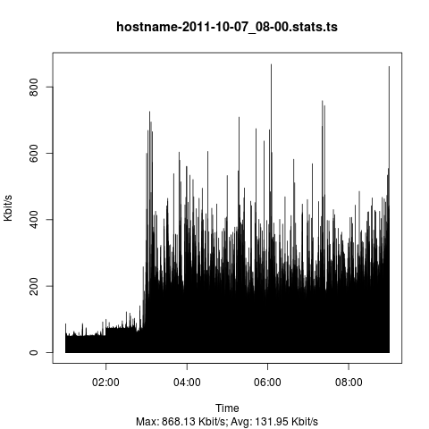
Resulting graph
There are sexier graphs out there but from a functional standpoint it does the job.

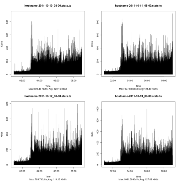
Combining graphs
R is fully capabale of creating a collection of graphs from a bunch of files but personally I think it's a lot more involved than simply using ImageMagick's montage command.
montage -geometry <Width>x<Height> <GraphFiles> <OutputGraph>
Yields a similar graph like the one below (intentionally downsampled to fit page)
